

VillaKeep


MY ROLE
As the lead product designer, I oversaw the end-to-end product design process, transforming ideas into a polished, user-centered solution.
Managing properties is hard.
Sometimes, it's even boring.
For property owners juggling work and personal life, home maintenance often takes a backseat. While no one thinks about the lifecycle of everyday appliances like a refrigerator, it can be a major inconvenience and financial burden when one unexpectedly breaks down.
From chaos to control—property management made simple.
VillaKeep is an innovative home asset management app designed to simplify the complexities of managing properties. Tailored for homeowners, landlords, and Airbnb hosts, this app provides comprehensive tools to track the lifecycle of appliances, plan for significant home expenses, and manage multiple properties from a single platform.
Research & Ideation
COMPETITIVE ANALYSIS
Exploring competitors in the asset management market.

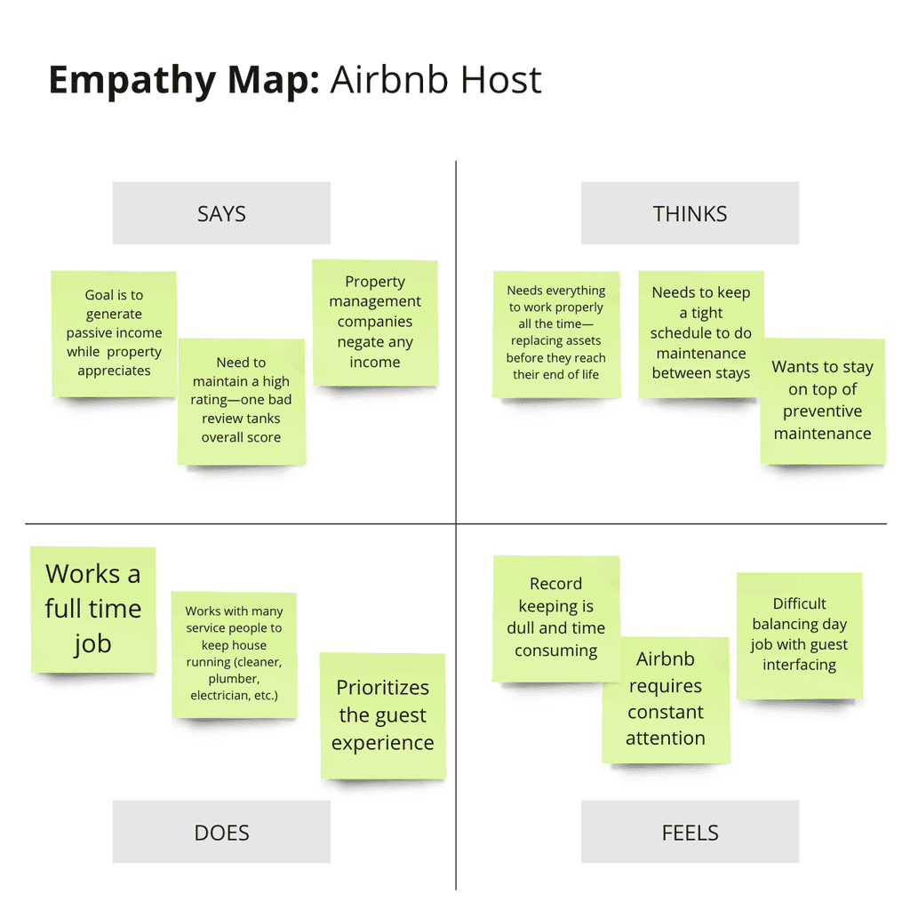
THE USERS
Through research and interviews, I identified four target personas for VillaKeep.


INSIGHTS FROM USER RESEARCH
Between work, life, and everything else, maintenance slips through the cracks. Unexpected repairs pile on financial stress, and finding reliable services just adds to the headache.
User Needs:
Financial planning
Preventative maintenance
Affordability
Functional home
Balance responsibilities
Pain Points:
Tedious and boring
Financial stress
Income pressure
Unreliable services
Not enough time


Initial Designs
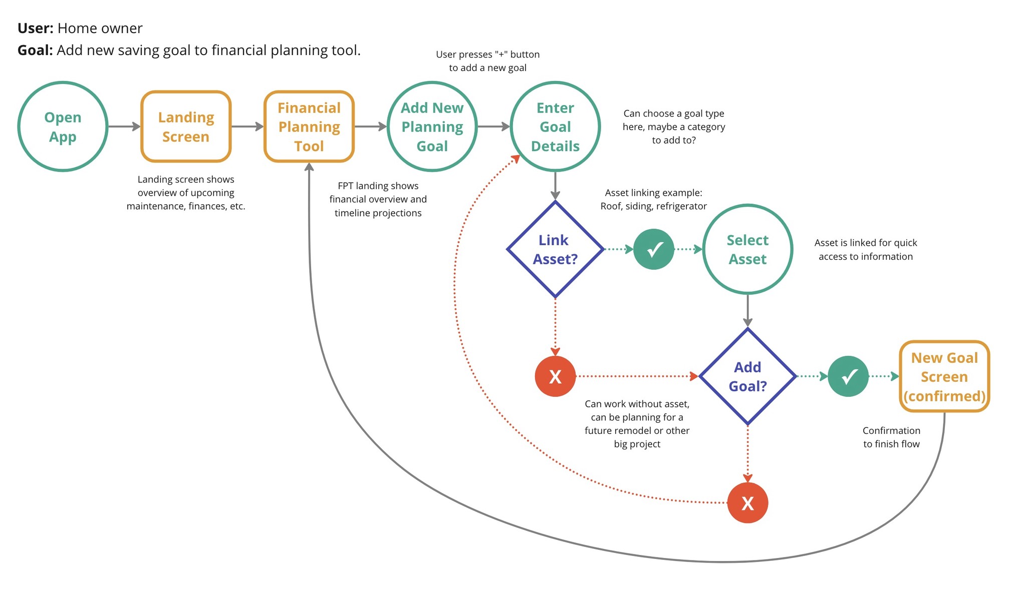
USER FLOWS + INFORMATION ARCHITECTURE
Simplicity guided my design, focusing on creating a clear and intuitive structure.
Building on user pain points, I created tailored flows for each persona, outlining key actions to address their needs:

WIREFRAMES & LOFI PROTOTYPE
From paper to pixels.


USABILITY STUDY
Hang on, what does Discover tab even do?
Using the lofi prototype above, I conducted multiple Think-Aloud sessions, where users completed specific tasks while verbalizing their thoughts as they navigated an interactive prototype. The most consistent feedback I received was that the Discover tab was confusing and the current financial model wasn't making sense, prompting a swift redesign.
Landing Page
Users felt confused and stagnant on the app's landing page
Savings Plan
60% of users felt the financial model was inaccurate
Discover Tab
90% abandonment rate on tasks including the discover tab
Asset Insights
Users wanted clearer insights for asset financial guidance
Service Profile
Customer reviews play a key role in service selection
Iterating and Improving
This section is in progress, check back soon for a deeper dive into my iterative process!
Landing Screen Redesign
Tasks section removed
Based on measured time on task and direct user feedback, I concluded that the home page needed a full redesign. The tasks functionality was fully removed due to stakeholder input and lack of clear user needs.
Overviews added
Users weren't sure where to go from the home screen in the lofi design. Adding these cards allows users more click-through paths to other features of the app, as well as quick insights on their properties.


Discover → VillaMarket
Name and icon redesign
Every participant in the usability study struggled to find the discover tab unprompted, and commented that the name and the icon were confusing. To address this I redesigned the tab, renaming it to "VillaMarket" to add a branded element and updating the icon to match.
Landing screen added
In my initial design, users were thrown right into the search feature, which many found jarring. I added a landing screen to the VillaMarket tab to give users space to browse before searching for any specific item.


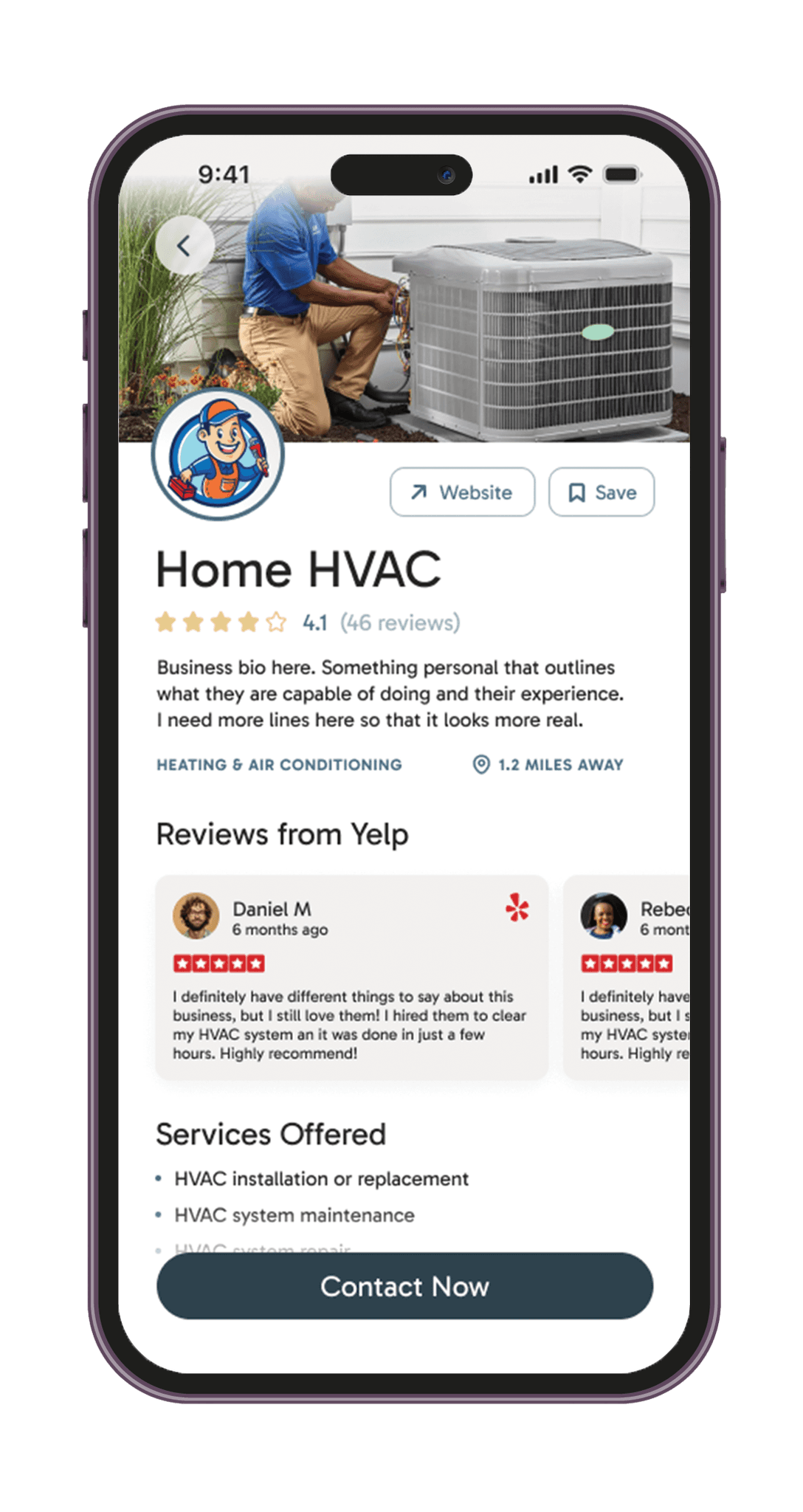
Yelp Integration
Added Yelp review plugin
One participant put it well, "these days, if someone doesn't have a review, I don't even wanna talk to them." To avoid reinventing the wheel, I added a Yelp plugin that shows business' reviews and ratings so that users feel more comfortable finding and trusting services on this app.
Expanded profile information
Originally, I only had sections for bio and certifications. In this redesign I expanded the information on this screen to include what services they offer to help users quickly find a qualified service technician.


Simplified Savings
Reserve lump sum
My initial design relied on the user linking multiple bank accounts and somehow managing their deposits through this app. Users quickly felt confused by this and one pointed out that HOAs tend to manage their reserve as a lump sum that is allocated to projects by their priority. To mimic this, I added a feature for users to choose priority for their projects and an option for forced allocation.


Fine-tuning Asset Info
Cost-benefit analysis added
Multiple participants commented that they liked having detailed information on their assets, especially when making decisions on replacing them. To address this use case, I added a cost-benefit analysis to aid users in understanding their assets and making informed financial decisions.
Service history expanded
Many users felt they wanted to record more asset information in their service history log, so I added the capability to track work cost and who serviced the asset.

